
Zwilling.com
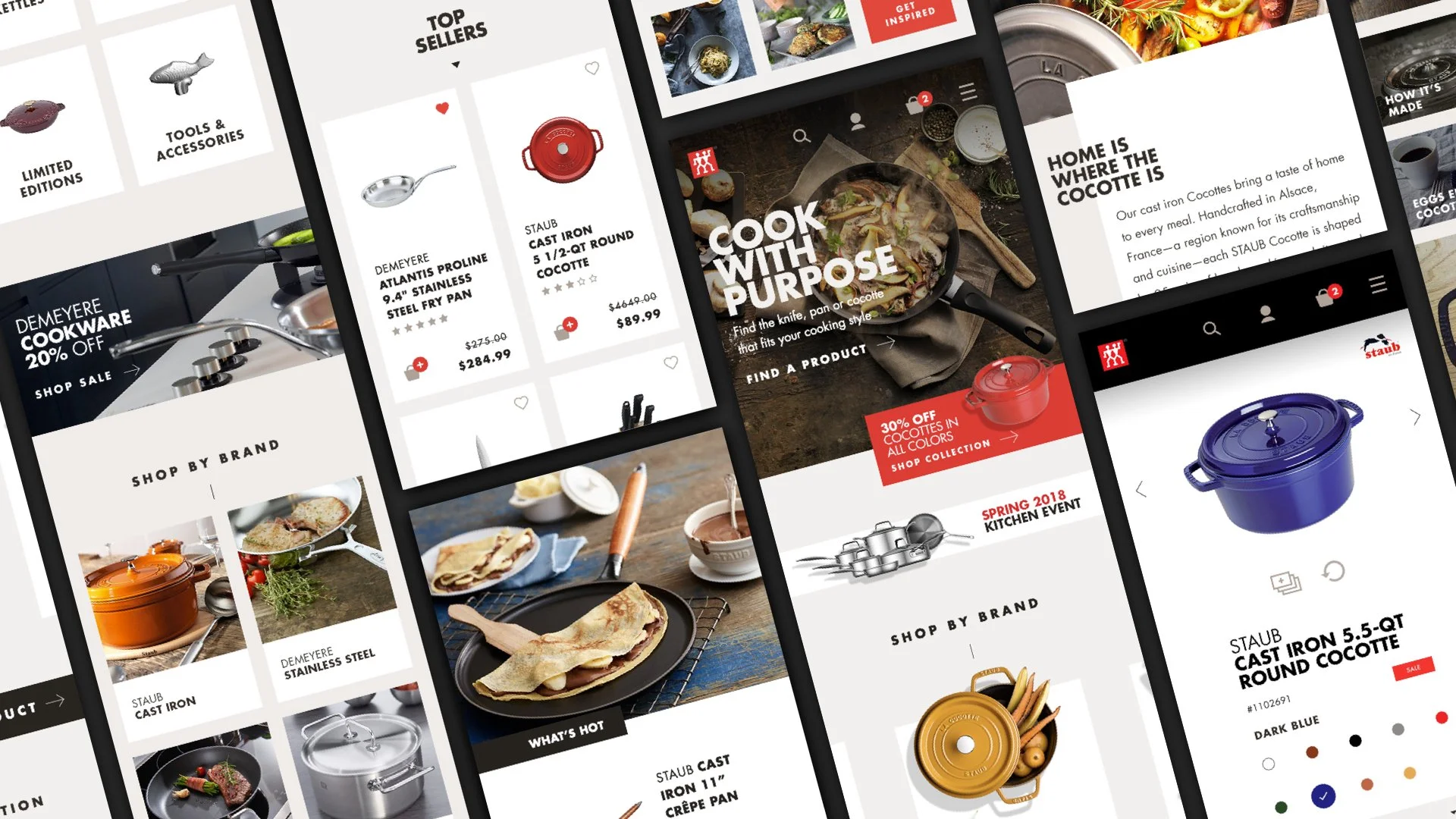
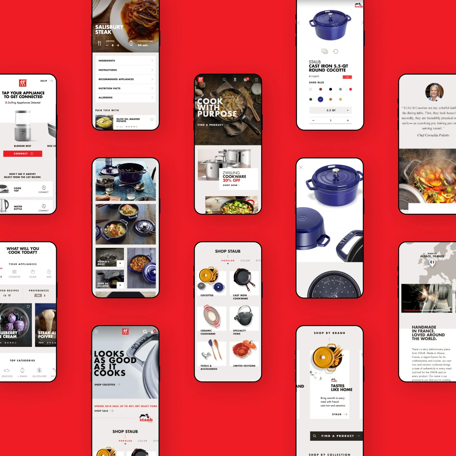
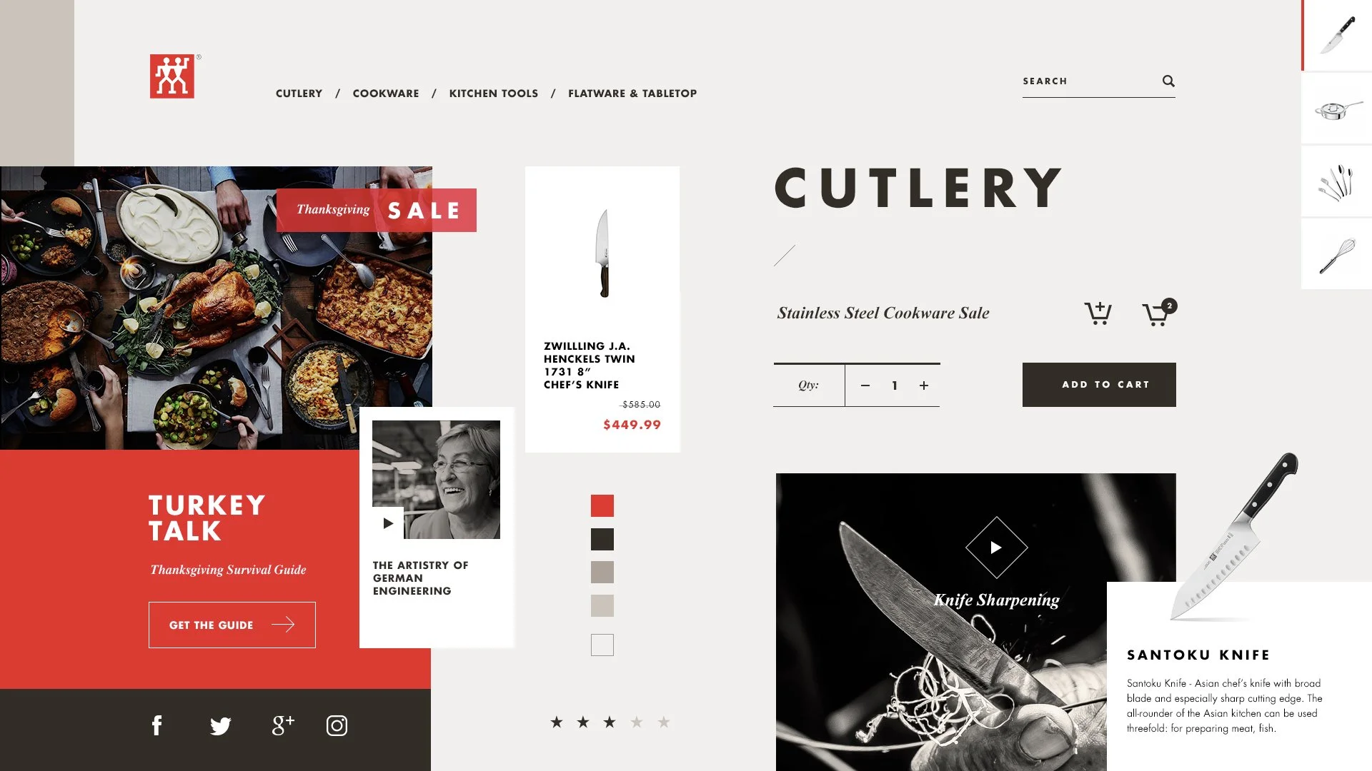
Modernizing a centuries-old culinary icon for a digital-first audience. Zwilling J.A. Henckels has a deep history in craftsmanship, but their multi-brand platform needed a complete design overhaul to keep up with modern e-commerce. I worked with the team to lead a transformation that unified their brands across a single, intuitive platform—spanning web, CRM, and connected appliances. By focusing on a clearer, more approachable visual language, we delivered a 51% increase in sales and added over 50,000 new users in just three months.


Concept Design
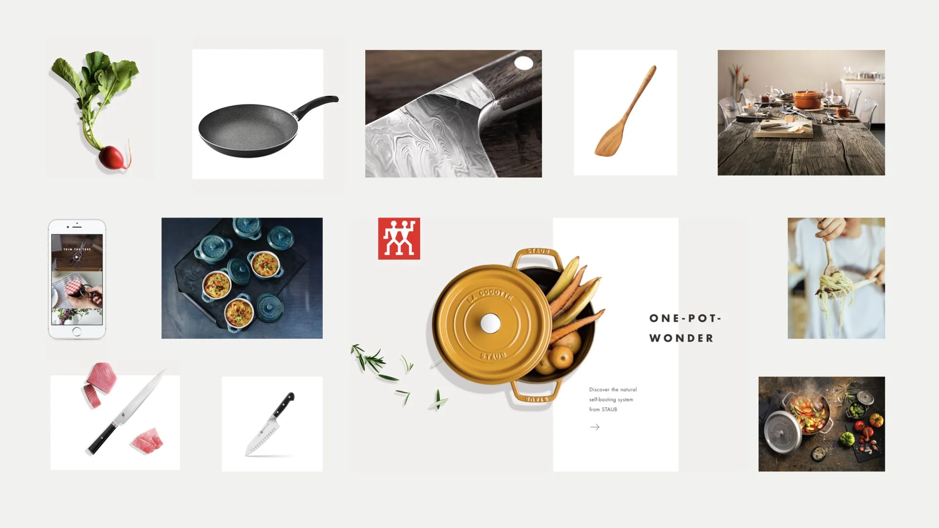
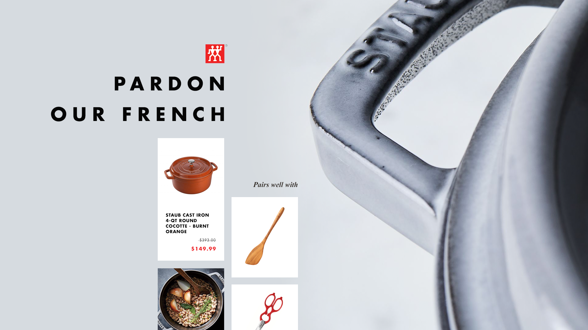
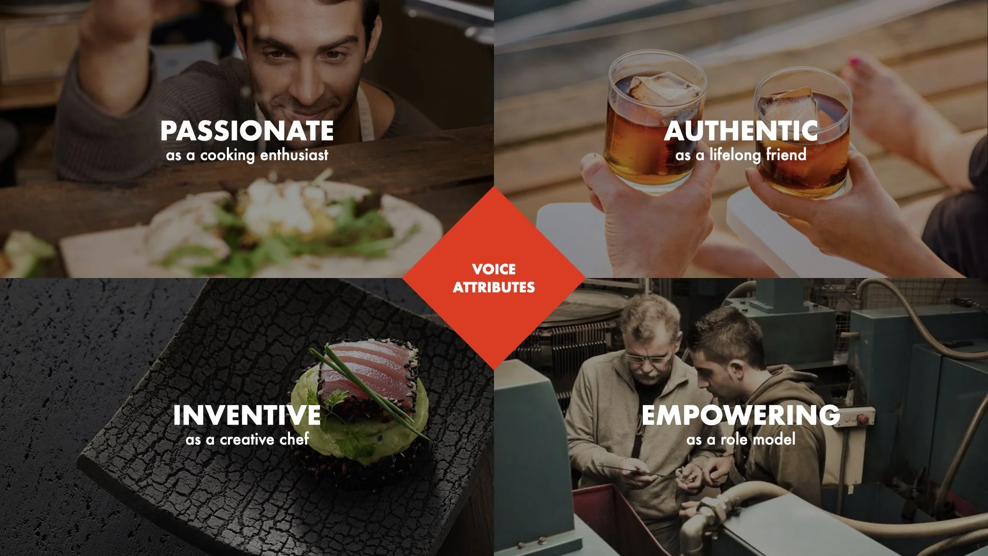
Fortunately, we nailed the look and feel in the pitch. From there we got to work exploring gestural designs and mood boards, honing in on the final design system. Our visual language embodied the precise products with approachable messaging and a warmer color palette.


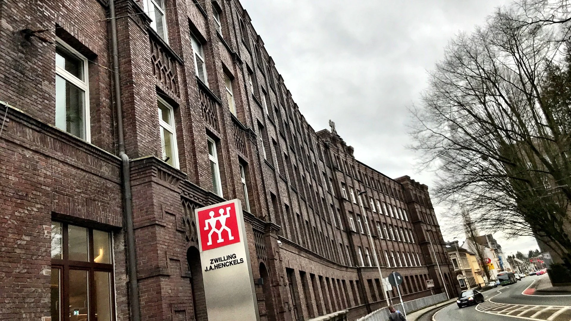
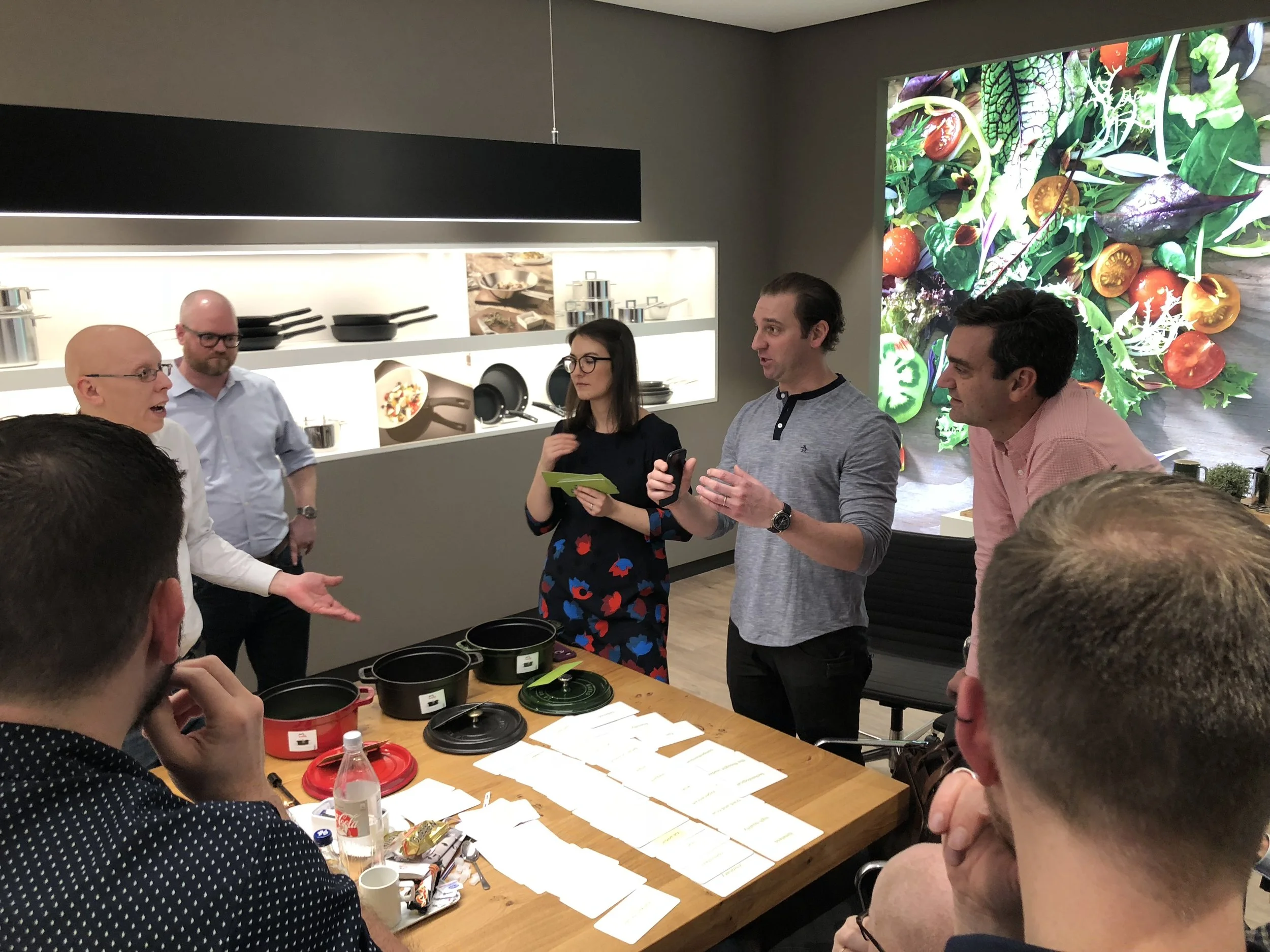
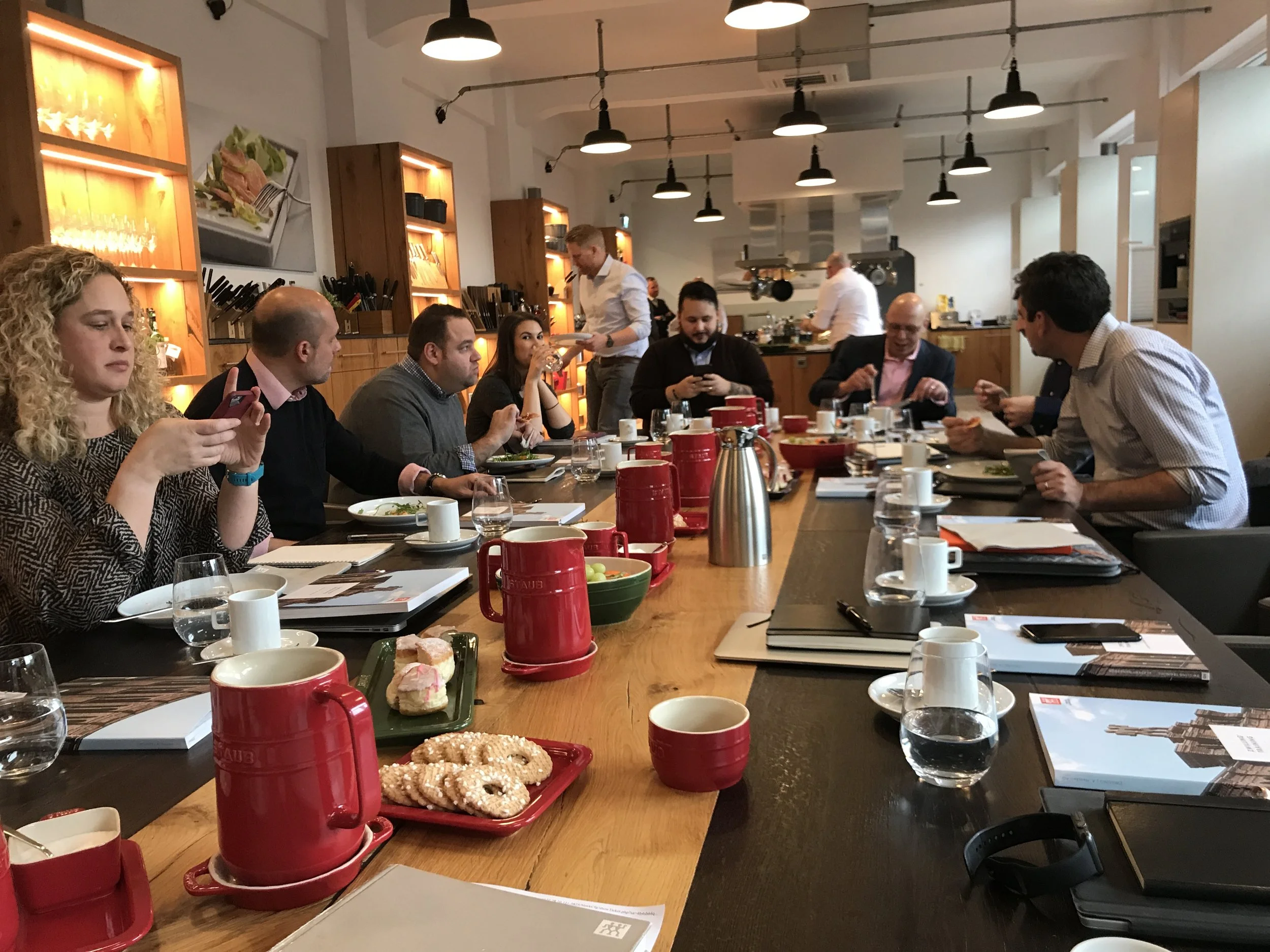
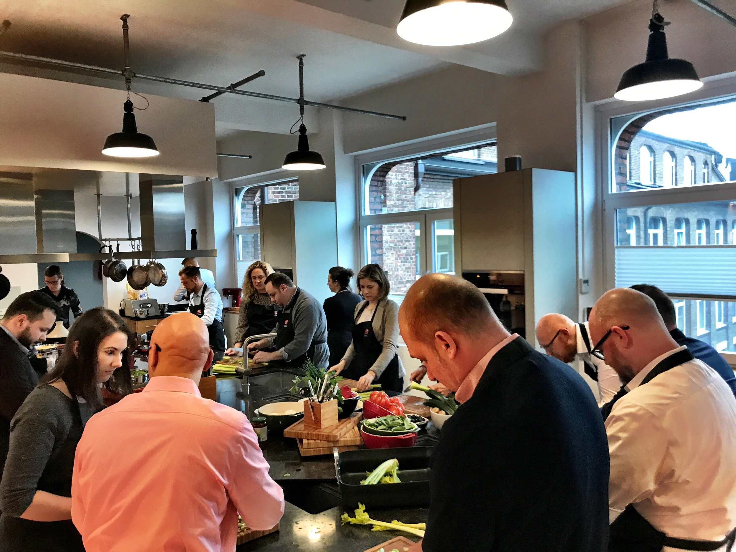
To truly understand the brand, we started with a full immersion at Zwilling’s headquarters in Solingen, Germany. We spent our days sharpening knives and cooking together, which gave us a firsthand look at the precision and quality we needed to translate into the digital experience. Those early sessions didn't just teach us about the products; they helped us build the trust and collaboration necessary to overhaul a 400-year-old brand. (And for the record: karaoke in German is a losing battle.)
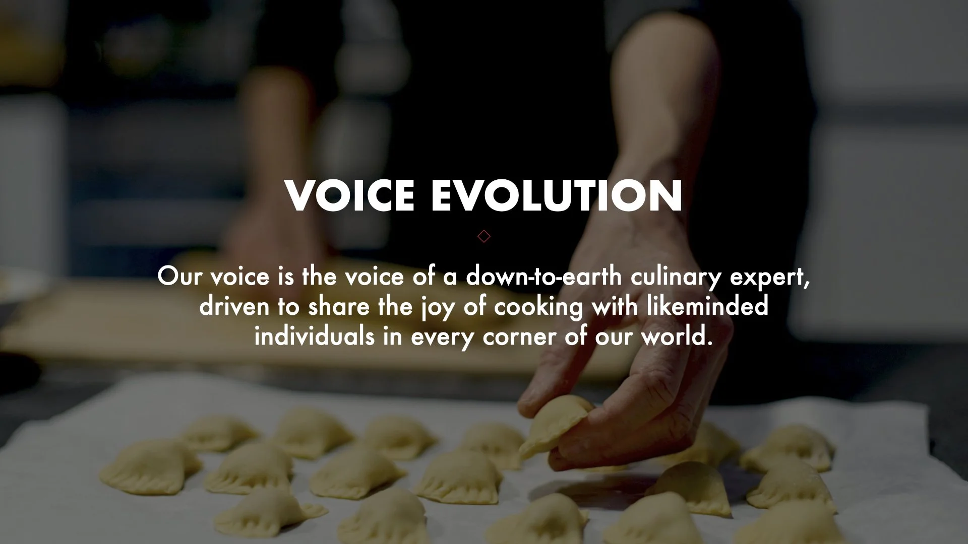
Immersive design starts in the kitchen.

My Role – Creative Director
Ricardo Salema – Executive Creative Director
Design – Yoonjee Kang, Lisa Lee
Copy – Karen Kelley
UX – Sasha Giacoppo, Matt Drazin
Motion – Aj Kolb
Team